
Digitizing an In-Clinic Refill Workflow
Saving nurses time while enhancing patient oversight.

Role
Senior UX Designer
Outcome
70% faster time-to-refill
Scale
2,800+ clinics
Scope
User Research
UX Design
Prototyping
SLDS Design System
Team
Product manager
Business system analyst
Salesforce engineers
Front-end engineers
Data engineers
"David's remarkable initiative in building our UI/UX architecture from scratch has been nothing short of impressive."

Larissa Doronina
Principal UX Architect,
Fresenius Medical Care

The Problem
Reliance on RAF forms
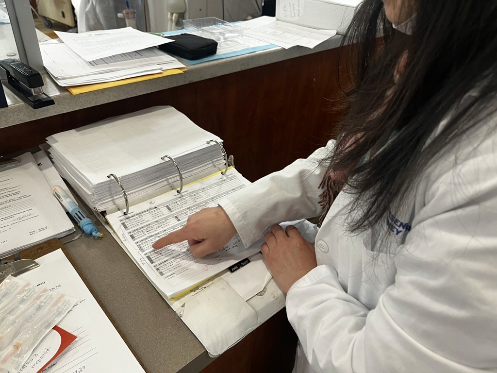
Reliance on forms, often riddled with errors needing to be faxed back and forth, with list of weekly refill needs.
Innefiency and fragmentation
Clinicians waste time hunting for data, hindering timely clinical decisions, and ultimately fueling frustration and burnout.
How might we distill dozens of refill concepts into a shared framework across data, workflow, engineering, and UI?
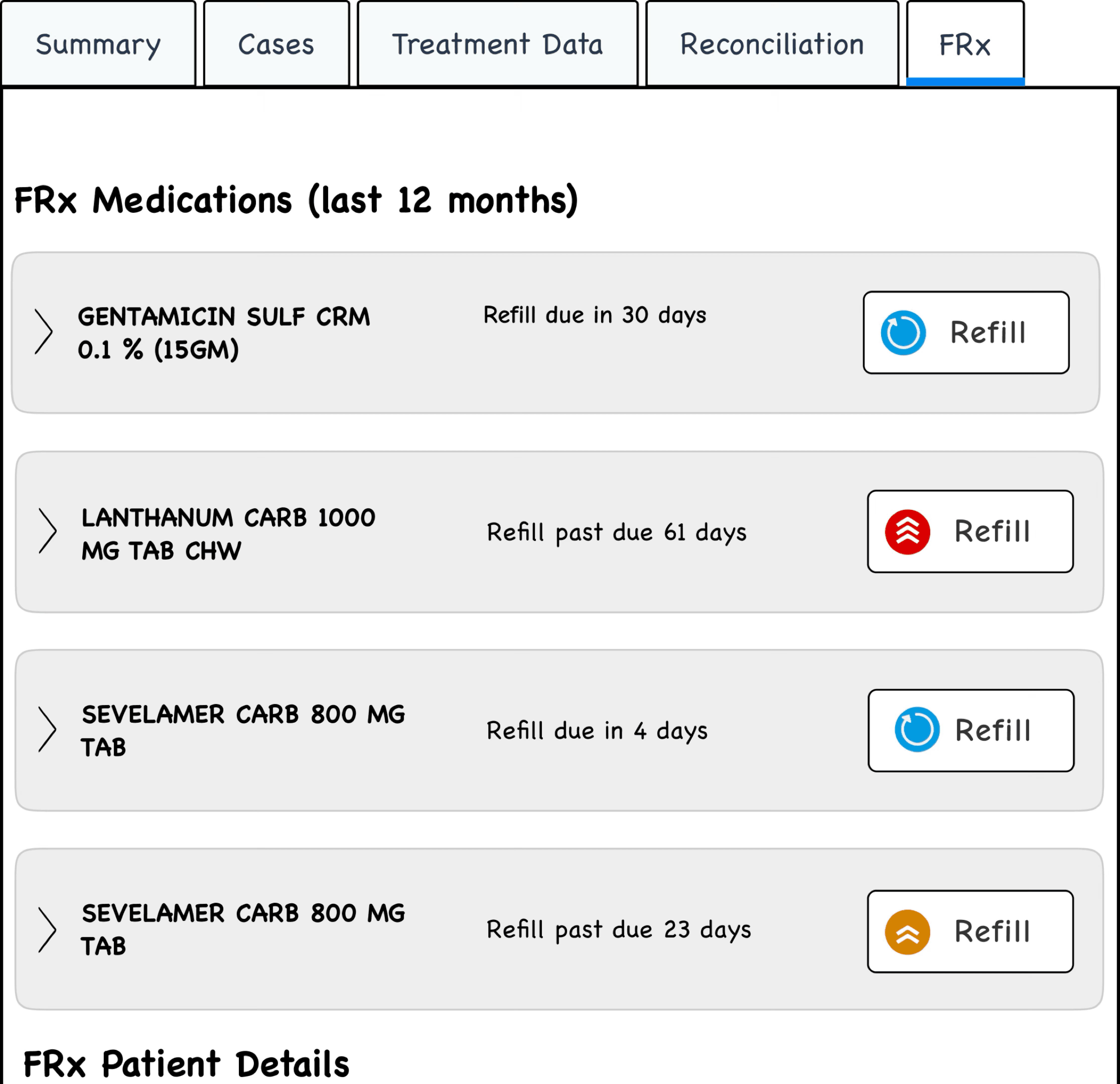
Mapping objects

Identifying Dozens of System Objects
Structuring Objects
Key attributes for each object surface first; secondary details stay tucked behind a click, using progressive disclosure to keep screens calm yet powerful.
The result: clinicians see exactly what they need at a glance, can dive deeper in one step, and never feel buried by data.
How might we make the next step obvious:
reducing hunting and hesitation?
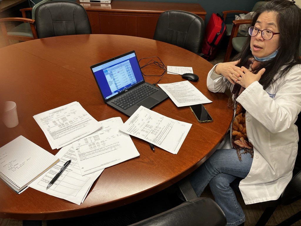
Testing and iterating
Object discoverability
Stripping the sketch down to the drug name and due‑date made the target object pop immediately, proof that “less is more” starts with rough prototypes, not polished comps.
Date label clarity
Many paused to look up the current date just to confirm “Today” was correct. The obvious fix: implement a date picker upfront, with the default set to today. This gave users clarity without extra clicks or confusion.
Progressive disclosure still helped keep the screen clean, but primary actions and date selections needed to be unmistakably clear.
How might we validate coverage of common and high-risk scenarios before scaling?
Pre-enterprise release

Pilot Edge-Case Discovery
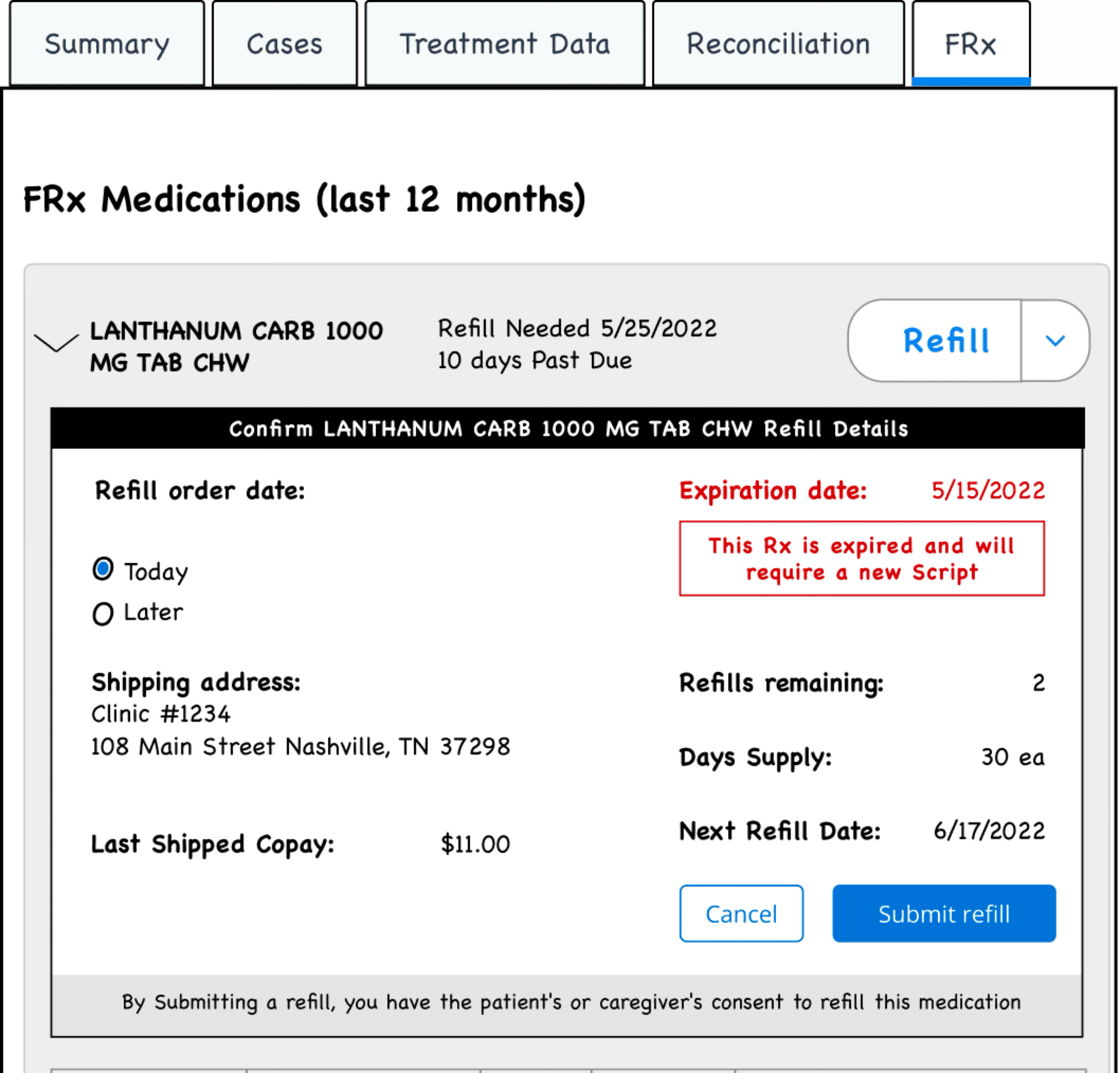
Dynamic address management
Care teams regularly needed to switch shipping between clinic, patient home, and temporary/vacation addresses. We added a unified address selector with a confirmation step to prevent mis-shipments.

Nuanced hold reasons
Nurses placed medications on hold for diverse clinical and administrative reasons. We replaced a simple confirmation with a dropdown of standardized hold categories (and an “Other” field), ensuring every pause carried clear context.

Bulk cancellation flows
Occasionally multiple refills required canceling at once (e.g., med changes mid-cycle). We introduced a multi-select table and enforced a “reason for cancellation” per batch, streamlining what had been a tedious, error-prone phone process.
Results

Reported ~70% faster refills with stronger patient-safety checks and oversight. Launched in 2023 to 2,800+ clinics, supporting 43,000+ patients
What clinicians said


